Last Updated: January 16, 2026

How much color should I put in the nursery? Will it be too bright? Will there be enough stimulation? These are some of the most common questions we hear from our clients as they explore nursery color psychology. Understanding how different baby colors for nursery affect your little one can help you create a balanced, soothing space.
While there is still much scientific debate about how color affects infants, there is endless evidence showing how color affects adults—marketing execs have poured millions into this research. It’s no coincidence that most fast food restaurants are red and yellow—these colors can make you feel more hungry.
Why not take advantage of all this research and use it to choose your nursery colors? While your baby may not perceive colors correctly for a while, they will when they get older and as those marketing execs have proven—color does affect us.

Here’s a quick rundown of some color theory and how it can help your choose the right paint color for your child’s nursery.
Understanding Warm Nursery Colors
Red – Passion, Excitement, Emotional
Red is bold and attracts a lot of attention. It can work in a nursery as an accent but should be avoided wall to wall. Red is the “hottest” color and may invoke volatile personality traits to stand out.

Orange – Warm, Comforting & Cozy
Orange is a very comfortable color. It promotes a welcoming feeling and inspires interpersonal conversation. Orange is friendly and puts reservations at ease. Use a darker orange for a super-cozy atmosphere or bright orange for a punch of modern!

Yellow – Lively, Energetic & Cheerful
Yellow is sunny and bright but use with caution. Too much or too bright yellow can agitate a baby. Subtle yellow (think legal pads) promotes concentration and emotive thoughts.

The Benefits of Cool Nursery Colors
Green – Calming, Refreshing & Nurturing
Green is the best color to use in a learning environment. It promotes calmness of thinking and concentration. It is also very serene, calming and natural. Green is one of the best colors in decorating because it is so abundant in nature—you can’t go wrong!

Blue – Healing & Subtle
Blue is calming, but be careful with the shade. Gray-blues can lean towards sadness. Blue increases productivity, but should not be used around food. If you have a child who refuses to eat, avoid blue plates!
In the nursery, use warm or bright blues and avoid overusing navy or dark shades. Blue is also cooling, which is good for a baby who gets warm easily.

Creative and Emotive Tones
Purple – Dignified, Mysterious & Luxurious
Purple has long been associated with royalty, and that still holds today. Jewel tone purple is as regal as it gets. Pastel purples, like lavenders and lilacs, are more calming and serene but still have that luxurious feel. Purple is rare in nature therefore it is the most “unnatural” color.

Pink – Romantic, Loving & Feminine
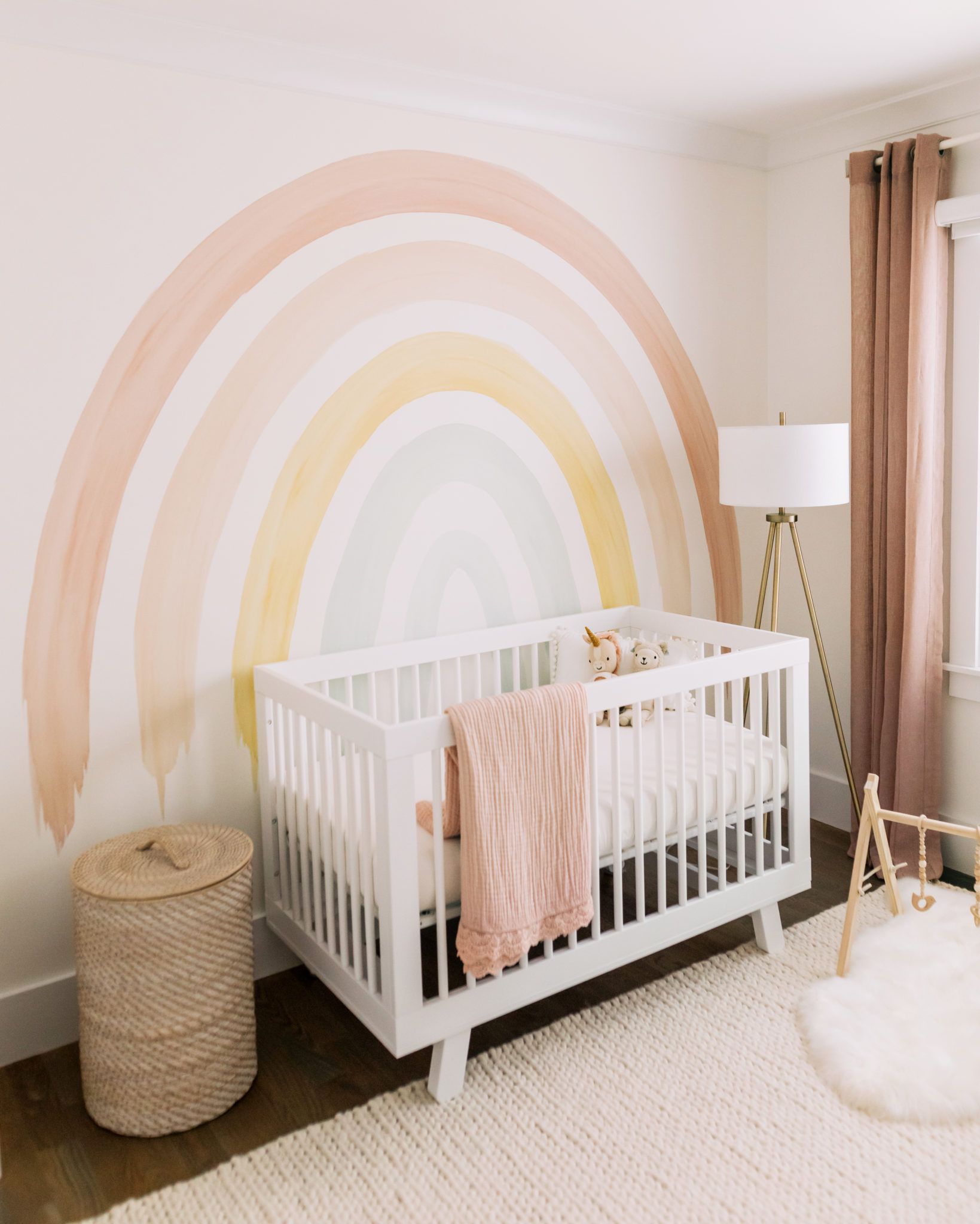
It’s no coincidence that little girls love pink. It is the universal color of all things girly. Pink is very calming as well, particularly with children who are prone to throwing fits or tantrums. Feel free to go nuts with pink in a girl’s nursery—the only ill effect may be a bit of a princess attitude!

Clean and Versatile Neutrals in Nursery Color Psychology
White – Clean, Pure & Innocent
White is angelic and sweet but can also promote secretiveness. Stay away from all white—use splashes of color to evoke emotion and openness. And beware—white is definitely prone to stains!

Gray – Introspective, Intuitive & Emotional
Gray inspires you to contemplate—the same way you may feel a bit down on a cloudy day (which is why raincoats are yellow). Be careful with gray. It’s advantages are that it promotes thought and emotion, but that includes sadness and loneliness.
Many famous poets and writers have been known to retreat to overcast locations to write, like Seattle. If you want to use gray, use a warm tone and mix in some brighter colors.

Grounding Earth Tones
Brown – Earthy & Grounded
Brown is the color of our earth, which makes it a great choice for a nursery. However, brown is also the color of, er, other things, so use with caution.

Go with a dark chocolate brown or a very light beige/tan. Avoid any of the middle shades as they can tend to look, well, poopy.

Black – Authoritative & Powerful
Black is another color to use in moderation. It is strong and dark. Make sure to use in a room with big windows and lots of natural lighting. Black should be used as an accent color—black walls are a nightmare to repaint!

There is an endless amount of information on color out there. If you’re planning your baby room colors, take a few minutes and do a little research. After all, your baby will be in this room until you decide to repaint.
Be sure to checkout our curated collection of nursery wallpaper by color.